Kiels Terapi
Logo design
Logo design and choice of color and typeface for Marianna Kiel, a psycho therapist located in Søborg.
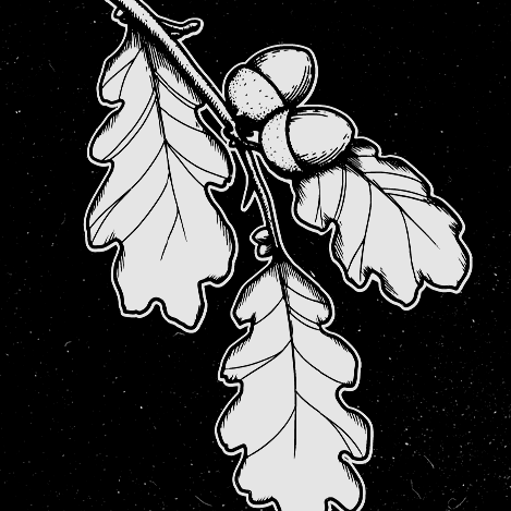
By interviewing Marianne and reading about her approach to psychotherapy, it became clear that what needed to be present in the logo was nature, and more specifically trees.
The symbol mark was heavily inspired by the phenomenon known as crown shyness, and personifies all the things we as humans can struggle with mentally, but also how we might deal with those struggles.
Aptos was choosen as the typeface because of the accessibility a system typeface has, for someone who isn't overly skilled in design.
The spacing between the glyphs in the wordmark, got adjusted tighter to appear less separate.
For a closer and more interactive look, visit kielsterapi.dk
Website developed and designed by Auxo.dk


