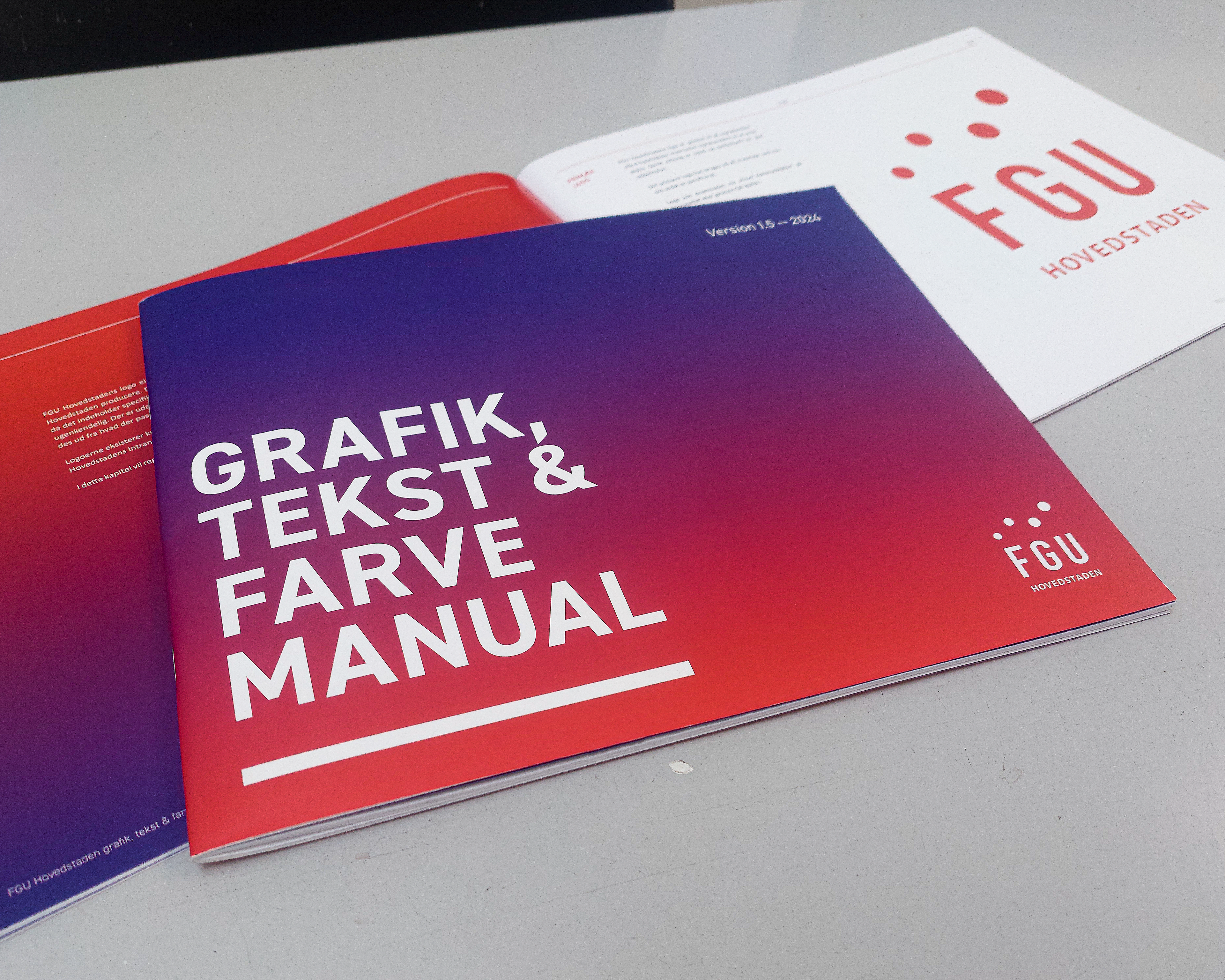
FGU Hovedstaden
Design manual
As my internship at FGU Hovedstaden was ending, i took the initiative to collect all of me and my colleagues design work for FGU Hovedstaden and develop a Design Manual.
FGU Hovedstaden exists inbetween the school system, as place where students can experience an alternative school that is less focused on grades and more focused on the indiviuals, their wants and needs - a school where practical skills are values as highly as academic skills, and where you are free to develop your own creative projects.
When I started working at FGU Hovedstade, there only existed a logo and some general ideas of colors. I quickly got the role of not only visual production and communication, but also as art director.
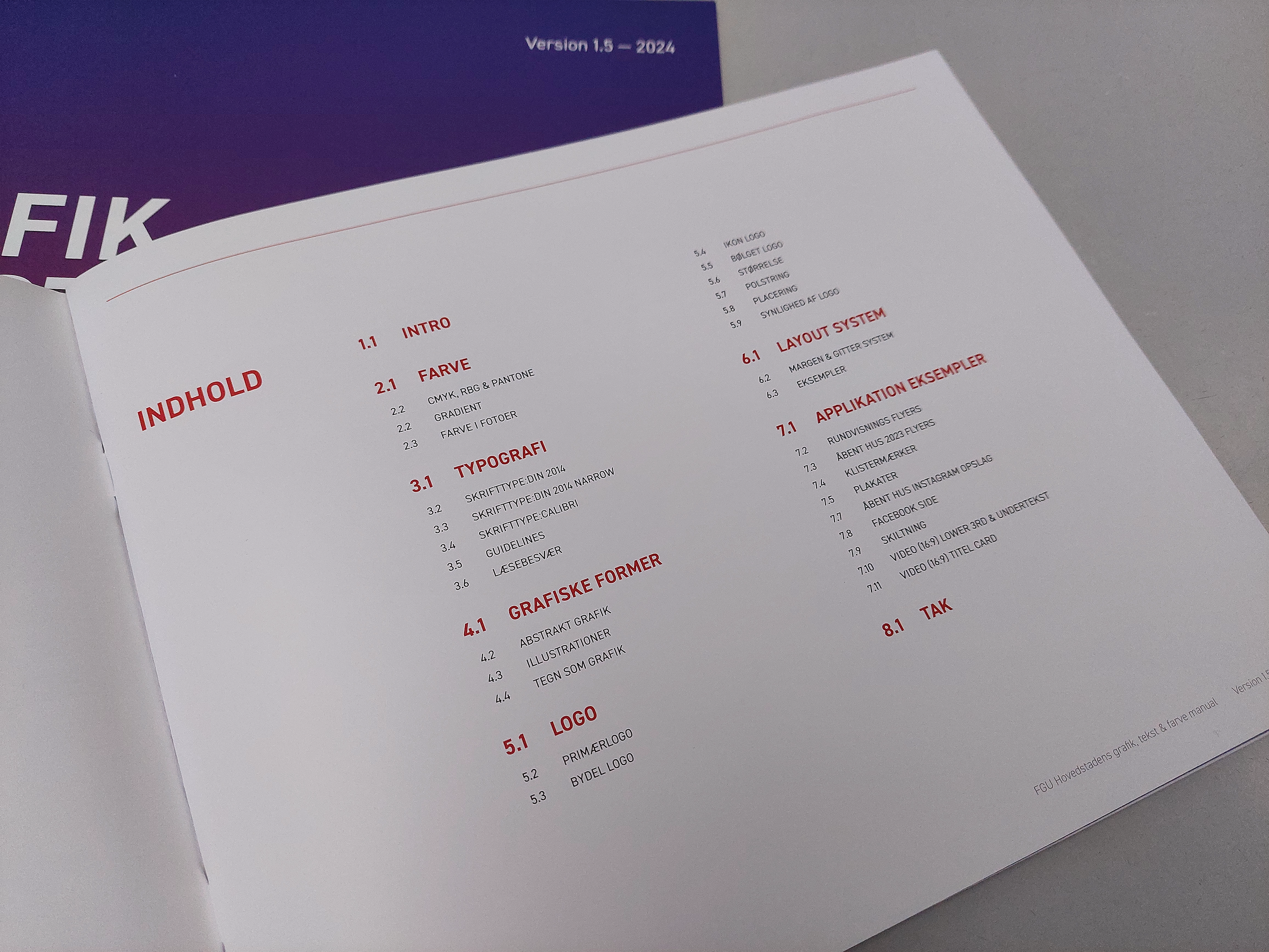
As such i found it fitting to leave a manual to my colleagues and possible future graphic designers, explaining shortly my perspective on FGU Hovedstadens identity and the groundwork of the graphic design i developed. As it would be hard to show all my work for FGU Hovedastaden, this exists as an overview of my nearly 4 year time there.
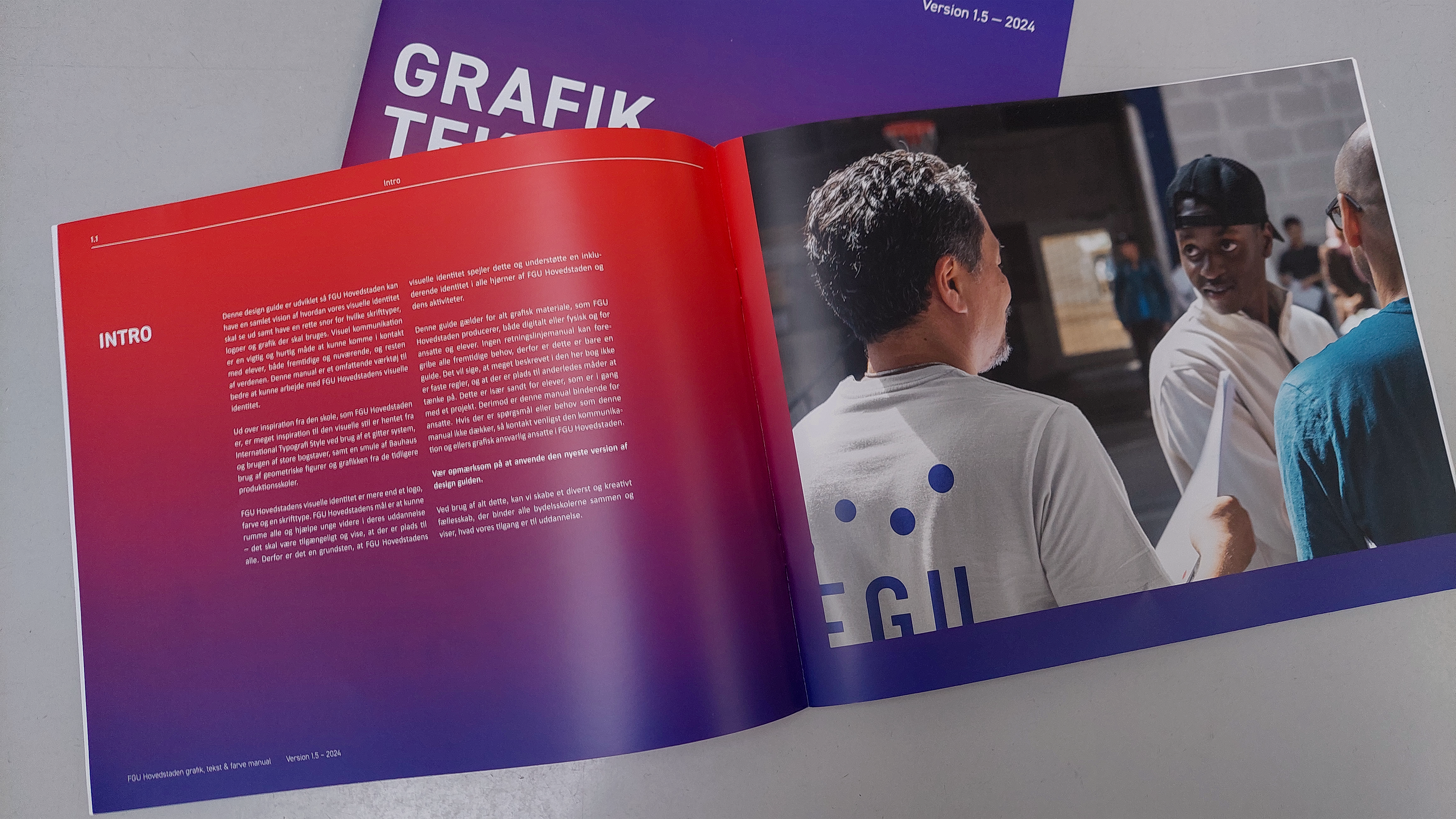
As FGU Hovedstaden gets a lot of young students with neurodiversity or who has a hard time learning, it was key to insure readability and stability while maintaining an element of boldness and youth in the visual identity. Essentially the goal was to look more like a youth center than a school.
As such bold colors, type, illustrations and photoes with an layered grid style layout, were used as the backbone of the identity.