Center for Voldsforebyggelse
Brand identity & strategy, website design
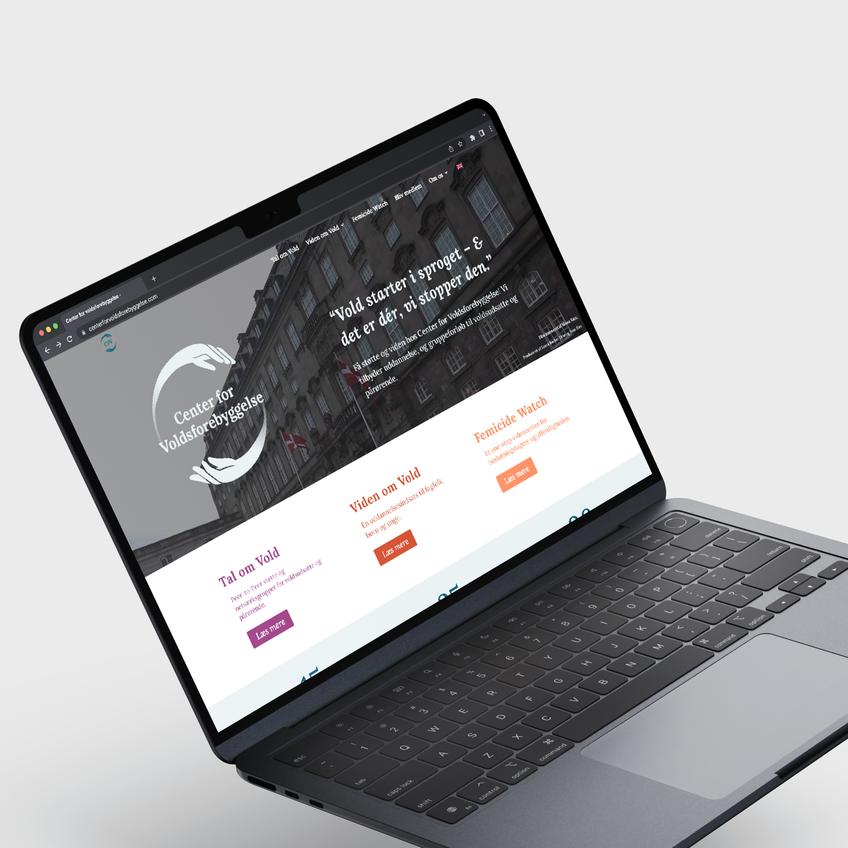
As part of the renaming of Center For Magtanalyse to Center For Voldsforebyggelse. Center For Voldsforebyggelse needed a rebrand – this included primarily new logos, typeface and colors, as well as a new website.
Main logo
Simplified logo
Center For Voldsforbyggelse is an organization that focuses on reducing gender based violence. A professional and gender-neutral look, that emphasizes the care and knowledge was needed.
I choose colors which contrasted the primary blue colors, because they are welcoming to all genders and stood out against the blue colors.
Secondary colors


Branch logos

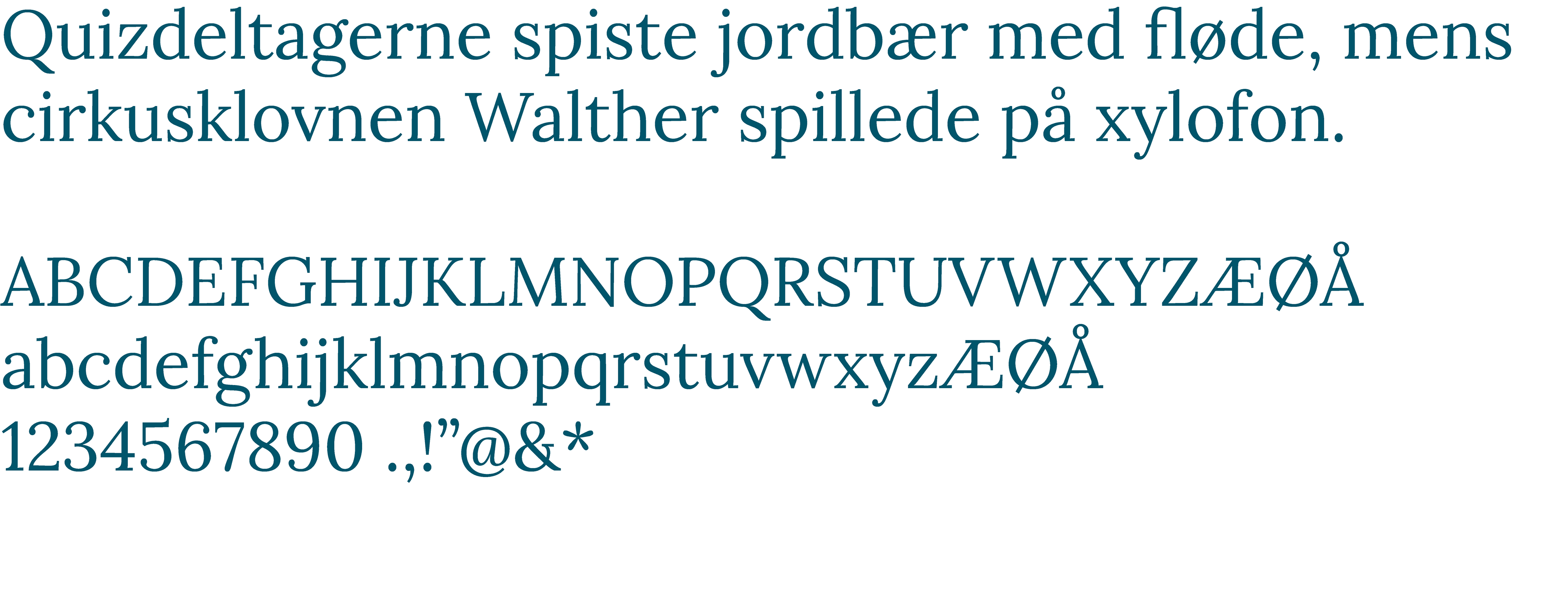
In collaberation with Center For Voldsforebyggelse the typeface Lora was chosen, as it is a serif font which aligns with the professional identity Center For Voldsforebyggelse has, while having small quirks that makes it look contemporary.
The typeface is also open source, which works great for a medium sized non-profit organization.
Typeface: Lora
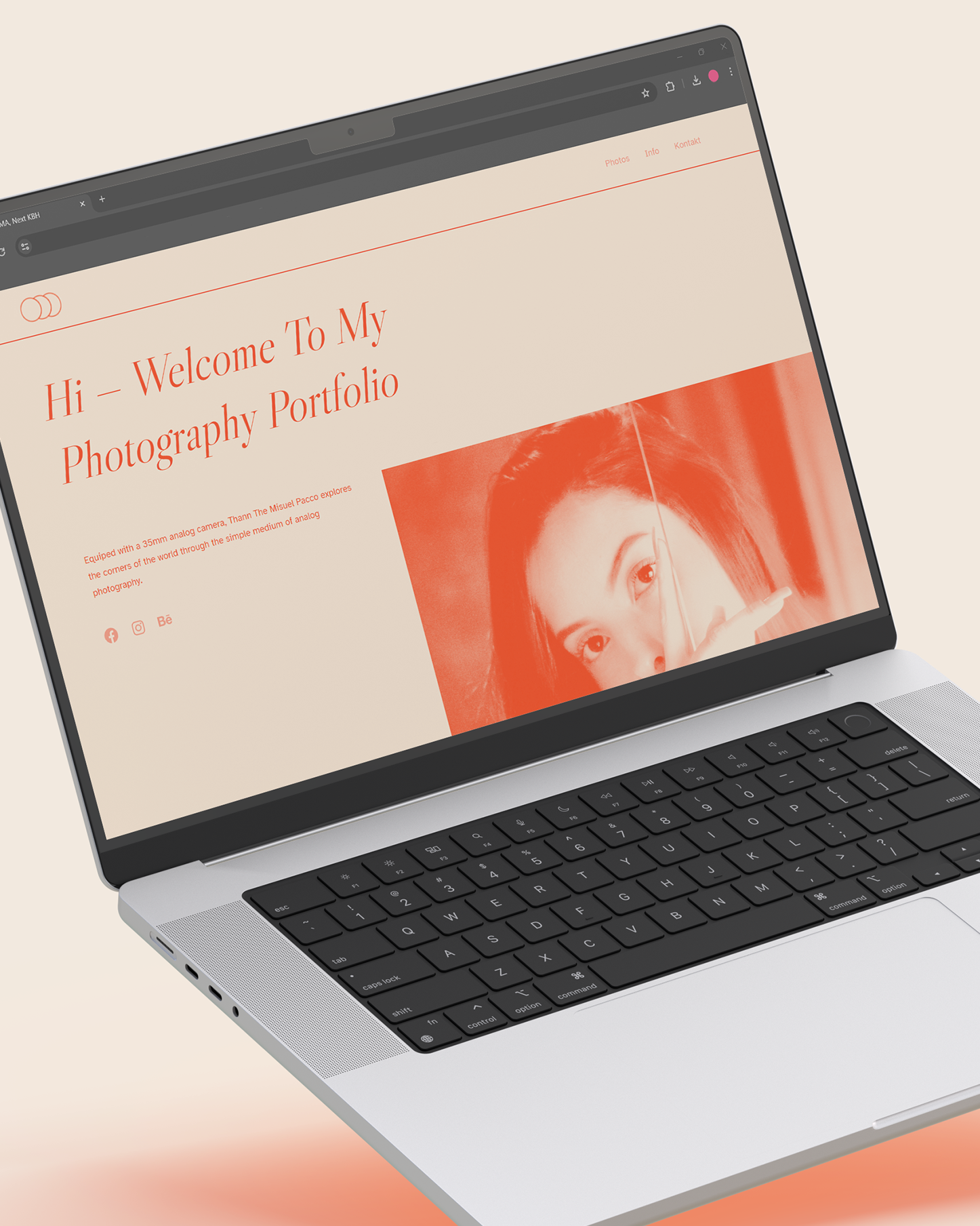
All of this ultimately ended out in me designing a new website. For a closer look please visit: centerforvoldsforebyggelse.com
